ANUNCIO: Felicitaciones a Darlene Holley, nuestro ganador! Darlene ha sido notificada. ¡Felicidades, de nuevo, Darlene.
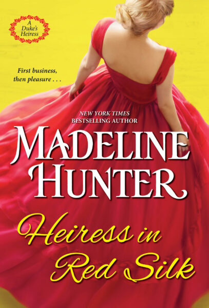
Sólo por diversión, I am giving away a pair of Swarovski earrings to one reader. Todo lo que tienes que hacer es comentario abajo en respuesta a esta pregunta: ¿Qué tipo de cubiertas prefieres en novelas románticas históricas? Parejas que abrazan? Justo el tipo? Sólo la heroína? Vistas panorámicas de casas solariegas, etc? Montajes de viñetas de la historia?
(Por favor, lea la letra pequeña, que estoy obligado a incluir: Sorteo terminará en diciembre 10, 2014, en 11:59 pm EST. El ganador será elegido al azar y contactados por correo electrónico y tendrá hasta diciembre 14 para responder. Debe ser 18 años de edad para entrar en, y ser un residente de los EE.UU. (triste!). No es necesario comprar. One entry por persona. No se puede canjear por dinero en efectivo. Nulo donde esté prohibido por la ley o reglamento. )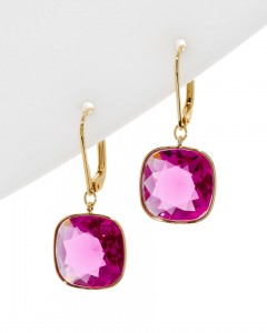


Prefer couple embracing.
Prefer something that won’t embarrass me if I’m reading in a public area. Thank goodness the “heaving bosoms busting out of bodice” covers seem to be on the wane.
I agree Amy. That’s why I always have a bookmark so I can hold it over the front cover when reading in public.
I agree, too, Carol & Amy! That’s why I sewed fabric book covers in paperback size! The added bonus is that there is a sewn-in bookmark, too! My main requirement is that the depiction of characters on the cover matches their description in the text!
as for me i like the covers with the beautiful plantations, mansions, cabins and castles. the couples embracing is worn to death, all those covers are starting to all look alike to me, and one persone without the other makes no sense to me.love.
You can solve that problem with an e-reader.
On second thought, I like the step back type covers where you can put the couple embracing or whatever under the front tastefully designed covers. I guess I feel a couple is more romantic. But I did really like your covers for the series with The Charmer, el Seductor, The Saint, etc. Maybe something like that again, a series of related cover design themes?
I love couples embracing with a nice bodice shot and a shirtless man!!!
I like a couple embracing with a great back ground..
Montages of vignettes
couple
Heronine
I love the current trend of long luxurious dresses, but I also really like the scenic covers. A good cover helps put me in the setting for the story.
I like the embracing couple.
I like couples on the covers, as long they look like what is described in the book.
Hot guy is a must!
I prefer a scenic picture with either a memento or some other clue to the book on it. Makes it easier to read around my kids, though a couple is nice too 🙂
Hero for sure!
Scenic view.
Couples. (and preferrable where the male is showing more skin than the female)
Vistas panorámicas de casas solariegas, but I like them all!!!
I LIKE THEM ALL. IF WE ONLY HAD A CHOICE OF ONE THEY WOULD LOOK ALL THE SAME.
I like the step back ones that have something simple on the front like a scenic picture with the step back showing the couple.
Don’t have a favorite, but do like for the cover to somehow “match” the storyline.
I agree!!
I like a picture of the heroine in her dress so I can immediately identify the time period.
I agree with Zabeth. I like to see the dress of the heroine so that I can get a sense and feel for her journey.
Couple embracing or just the woman. Not too much skin.
Couples embracing is fine if they are both properly dressed? Justo el tipo, or just the heroine, is ok too. Vistas panorámicas de casas solariegas, I don’t think would draw a reader in. As you can see I’m very flexible when it comes to covers, I’m more into content and I really enjoy your books.
Montages of vignettes
Call me old fashioned but I like the clinch covers best. 🙂 Since those seem to have gone the way of the dodo bird I like montages of vignettes from the story. What happened to the step-back covers? They seemed to please both camps – those that wanted the clinch covers and those who didn’t.
The Step-back covers, where there was that second cover under the first, have almost disappeared. A few books still get them, but not many. It was a cost saving move by publishers, plus booksellers told them it made no difference in sales, that the front cover was what had to get readers to pick up the book to check it out. My last step-back was in 2003, on Stealing Heaven. También, as my books are reprinted, the step-back is not included anymore 🙁
Hmm. We should check the sales of “Darling Beast” because I bought the paperback (for the stepback) and the Kindle edition. I still grab used paperbacks with stepbacks at yard sales and used book stores.
Any cover is great with me though I do prefer the ones that have the double covers? The inside covers add a bit more mystery to the book.
Couple
When ever I read a historic romance, I prefer the cover to match the book’s description theme scene. To the color of gown, hair, and backdrop. If the main character has black hair and the cover has blonde it leaves a bad taste in my mouth.
The cover which reflects the story and the characters. Heroes for sure.
I like to see a hot, handsome guy on the cover.
I prefer couples on covers, but they really should match the author’s description!
Couples, or hero, at least.
Couples embracing with a little skin!
I agree with Amy in Centreville (#1) and Karen Wong’s 8:03pm response (#2) – both of them express my opinion very well. Gracias, Amy and Karen!
I prefer couples that correctly represent the story’s hero/heroine, but a shirtless kilted gentleman never hurts either. 😉
Couples for sure. Him shirtless her open but not off.
I like the heroine in a beautiful story-appropriate gown.
I like the couple on the cover although prefer the guy not to have a bare chest. A house in background in nice.
I seem to prefer a cover with a couple embracing but also like a scenic home in the background – something to let me know the time period, etc. And as someone else mentioned something that I won’t be embarrassed to have in a public reading situation.
I prefer the couples, especially when they resemble the description of the couple from the book
i prefer the heroine on the cover.
I like heroes in unbuttoned white poet shirts, buckskin breeches, and riding books.
prefer montages. Gracias. Happy. New book!
I like the couple on the cover, but not necessarily in a embrace.
I like the man, the woman, or both
For a romance, I don’t want scenery.
And I never want a montage
Parejas que abrazan.
Couples. For me it feeds the romantic feelings.
I love the long luxurious dresses, the scenic covers, montages of vignettes, even scenery more than the couples. They never look like I imagine.
I love all kind of covers.My kid are in their 20’s but keep a cloth slip on cover for the more steamer covers because I keep a book in my carry bag to read when I can and so it well not up set anyone else.
All of the covers are beautiful,but I’d prefer the
heroine or scenic. That is why I go for the Amish books for the same reason as the others,but I have
a book cover I use over mine for in the public.
Ruth
It’s the vibrant colours used when creating a cover illustration that I love…I also love the colour white for the fonts’ lettering…what I don’t like is a woman depicted in a gorgeous gown with her back opened and no undergarments…or her hair tied up at the back of her head in a simple bun, as if someone didn’t have the monies for hair/make-up in their budget…Author Jen Turano has awesome covers!
I like the beautiful dresses on the cover, if it is actually worn in the book. Kilt or tux, I like covers with nobody half naked. And finally a nice backdrop sets the tone. If you had a white cover with black font and I saw your name as author … I would have to read it … very much enjoy your writing … looking forward to your next book.
I like scenery etc, something that doesn’t embarrass me in front of my kids! I like the covers I see of UK versions of my favorite authors–light-hearted illustrations etc. 🙂
I prefer just the heroine on the cover. I like to see a beautiful dress and I don’t really like to see faces. I prefer the covers where she is looking away with some kind of landscape surrounding her.
I like to see the couple together. It implants the image of them as a couple in my mind.
I prefer a couple, or the main guy.
couples or scenic
Just the hunky guy! 🙂
I’m a fan of heroines on the book – I love the gorgeous clothes! I prefer it, aunque, where her face isn’t shown since that colors my image of her. Scenic manors and dashing heroes are good too…I read ’em all! 😉
I notice covers so I want a cover that draws my attention, it can be female, male or both but like it to have color and clear picture, background can look like mist or fog just as long as it relates to story and does not look cheap like the old b rated movies. I personally like feminine things like lace and satin not belts, chains etc. hope this is what you wanted to know.
I prefer the person/people on the cover match the character descriptions (hair, eye color, build), clothed & posed suitable to the time period. The steamy clothes awry image on the stepback…let’s stop perpetuating the bodice ripper cliché. Love the gown covers, when accurate, and the cropped partial face/facing away poses.
I prefer the hero on the cover but with the heroine somewhere on the cover as well. Like in his dreams or something like that!
Just the guy and an image that is suitable for transit — nothing over the top.
I like scenic views of castles/manners – it makes me want to travel to see them.
I prefer montages or scenic views. Covers are important to drawing me in and helping me remember the story.
I’ve got young kids, ride public transport and would love to have a book with me when I take lunch at work. Can you imagine the conundrum with “steamy” covers? Dramatic solid colored covers with bold fonts and other more demure covers that don’t project sex are easier for me to take along. Thank you for asking!
Prefer the embracing couple however nothing too risqué…gotta be comfy with reading on a plane without people judging me by the “nekkid” couple doing gymnastics on my book. 😉
I like most covers – except the heaving bosoms. The heroine and hero can be embracing, but I don’t like the heaving bosoms of yore. I also find the bland covers – the ones with just the title and some sort of discreet symbol boring and less exciting, though I understand why they were/are a thing. For the most part, if the cover art is good, I’m going to like it.
If it an historical romance, I like the cover to represent an era gone by (i.e., a background scene that is either Medieval, Regency or…). In the forefront of the cover, sin embargo, I like the main subject to be how the author views the “star” of the story (i.e., a man/brother/warrior or a woman/sister/independent thinker). 🙂 I leave pictures of embracing couples to the erotic authors. 🙂 Thanks for the interesting question, Madeline!
I think all of the list is good. Of course my top picks would be a girl and a guy embracing with her in a gown and the man with his shirt undone a few buttons. Scenic views would be ok as long as there is a girl or guy on it too.
I prefer scenic backgrounds depicting the era of the book. If the art is good, I will like it.
I like seeing the
hero mostly, but
also like couples
on the covers.
Carla from Utah
I like scenic background from the era or how the author views the main subjects of the story
Both hero and heroine, matching the story’s description.
Hero and heroine, matching the description in the story.
Hero and heroine, matching description in story.
I like the covers with heros and pictures of the manor in the background. It would be nice though if the hero’s pictures matched the description in the story.
I like all you suggested, but want all the books in a series to have the same type of cover. The heroines should have gorgeous dresses and the heroes really hot looking!
I don’t buy the book for the cover. I dislike the heaving bosoms and shirts off the men. I probably would prefer the scenic and believe me I’m not a prude. I just think that we women are more intelligent than the publishers believe us to be.
I get teased by my family about reading ” bodice rippers”, so I prefer a little bit more sedate cover. But I really appreciate when the author and publishers go to the trouble of making sure that the cover matches the story-character description and time period-wise. To read a regency romance with a black haired heroine and have a modern type gown on a blond for the cover will drive me crazy!My favorite covers are the fold back/two part type which hopefully show hero and heroine.
I prefer cover with both hero & heroine looking something like description in book with both dressed and not too embarrassing for kids to see.
I prefer not to be embarrassed in public as well, but I tend to prefer moody, covers that relate to the story.
I don’t really care for the couples embracing covers. I think the ones I like most are the wrap-around covers that may depict something from the story or one of the characters or a significant location from the story.
I prefer the hero and the heroine in a scene that reflects the essence of the story. (Although the cover of His Wicked Reputation provides good eye candy!)
I’m a dress girl. I love the gorgeous dresses.
I really like covers with couples embracing. It gives me a better picture of the characters when I am reading.
I love a cover with a manor house or something that conveys the setting and time period. A step back with the couple, or just the guy, is always appreciated.
I enjoy scenic covers on historic novels. It lets me feel I am visiting the site.
The gowns that the Women wore in that era were so beautiful, that I love seeing them on the cover. A close second would be a couple embracing. The only thing that I really dislike is seeing the heads cut off of anyone on the cover!!! To me, I think that it takes something away from the cover. It’s almost like a printing error.
I prefer to see a couple, especially if they actually look like the author describes them in a scene from the book.
I agree that the cover shouldn’t be too risque with body parts. Otherwise, I don’t have a strong preference about what covers should look like.
I like the scenic covers with a picture of the couple on the inside stepback cover.
I like when both the hero and heroine are on the cover. It helps fantasizing the story more realistic. También, the more clothes on from the time the better! I find I pass on books with scantily clad covers so my daughter doesn’t know if there is any smut in the books!
I like the cover to show historical scene with the characters portrayed as they are described in the book.
Very hard question. I’d like to San embracing couple with a beautiful landscape in background. Thank you for the opportunity. Enjoy your holidays.
Madeline – I enjoy the cover of the hot hero, with his shirt partly open & scenic background. Like you stated you can only do so many gowns. Gracias, for the giveaway. Enjoy your Thanksgiving & keep those books coming.
I prefer a cover of just the main character. I am around younger people@, ages 2-18, who tend to ask questions.
I really have no great preference to be honest. The cover just needs to be eyecatching with good colors. I would prefer pictures of the character/characters though, not just a landscape or manor picture. Happy Thanksgiving to you and yours!
I like a cover that matches the story.
I like to see a couple and to have the scenery on the cover match the location in the book.
I like the covers that are typically done for UK romance covers. They aren’t embarrassing if you have a paperback and just suit my personal taste.
I like to have a hint of what historical period it covers. If it is about pirates, I want to see a ship in the background or the hero with a sword in his hand
I like a picture of the heroine with a hint of the home or something that will tell me where we might be in the story.
i love seeing the beautiful manors. or couples embracing.
Personally, I don’t like people on the cover, especially if it’s a photograph (not a painting). I like to use my own imagination about what the characters will look like, not the cover designer’s interpretation. I prefer a beautiful manor house, scenery, etc. They’re just more artistic than a hunky guy on the cover.
I prefer Montages of vignettes from the story.
I have been persuaded to read books, with a good looking guy on the cover!
I like to see the heroine on the cover.
I like to see couples (with correct description)amongst montages from the story. If I see your name on a cover it doesn’t really matter what it looks like, i just know the story will be great! I’ve read all your books…in order…and wait patiently for each new one!
I prefer a couple or a man on the cover. I buy books by their author’s names,covers and titles, all three ways. If a book is by my favorite authors, then it matters not what is on the cover. Just their name is enough for me to buy their book. I have bought many books just from seeing the picture on cover. Certain key words in title also get me to purchase. I enjoy books where couple is married, so if I see word “Bride” in the title, it catches my attention, o “Pirate”, etc. I am guilty of passing up books with a boring cover, but later reading them and finding it was a fantastic read. I know I “should not judge a book by its cover”, but I do very often.
I personally do not like pictures of heroes, or heroines (alone or embracing) on covers. They seem cheesy to me, no matter how attractive the people are. Give me a basic cover with a design of some sort and I am happy.
I prefer scenic views of manors. It gives me an idea of the area of the story. I like to imagine my main characters from the description in the story. I dislike the heroes/heroines on the covers. Often it is the same models book to book. For me that takes away from the story.
Hero, Heroines or both with a home or landscape as a background. It gives me an idea of the characters and location involved involved.
I like sexy hero pictures.
Hero, Heroines or both in home or landscape depending on how well the cover portrays the couple inside the book. Nothing turns me off as a couple that does not match the character in the story.
i like to see a guy on the cover. i also like hero and herione as well, it depends on what stories are about.
I prefer covers with a picture of the couple on it, preferably in an embrace.
I definitely prefer scenic covers of manors but I do also like ones with just the man on the cover. I prefer the scenic one because I’m great at coming up with faces in my mind but gave a slightly harder time typically picturing the setting however I’m not opposed to having a chance to ogle a hot guy lol!
I prefer scenic views of old manor homes.
I know they say you can never judge a book by its cover BUT for me it can determine whether to buy the book or not. Putting the hero on the cover can be tricky. Beauty is in the eye of the beholder and if I’m not attracted to the ‘man’ I might not pick up the book. Long hair on a guy doesn’t turn me on and it almost stopped me from reading a ‘highlander’ series (by another author) which I now consider one of my favorites. I loved the covers of your The Rarest Blooms series especially Provocative in Pearls & Peligroso en diamantes. It was the covers that pulled me in. If I had to come up with answer I think I would take scenic views or the heroine (Rarest Blooms covers). By the way in my option the man on His Wicked Reputation cover is ‘hot’. Just saying…
Since we’re reading a historical book.. I think that the clothes should fit the period. And so should the descriptions..the last 1 I read was about a blond guy and a brown headed girl and the guy on the front had Blake hair and the girl red! The cheesy bodice ripper books I don’t even read, I know judging a book by its cover, but I can’t take that in public, or read it on my lunch at work.
I will always pick up a book with a handsome rogue on the front. I also like to see the hero and heroine on the front. Por supuesto, I read the blurb on the back on the book and that is another key to my purchase of the book. I love your stories and always look forward to the next one.
I love to see the countryside and the old castles and manors as they seem to invite me to go into the book. Old houses has always been something to catch my eye. Then a nice handsome man on the cover sure doesn’t hurt the view either.
I love to see the countryside and the old castles and manors as they seem to invite me to go into the book. Old houses has always been something to catch my eye. Then a nice handsome man on the cover sure doesn’t hurt the view either.
Love the earrings you selected.
I always prefer couples embracing, with a manor in the background is always nice.
I like a scenic background with the couple on it too
I wish everyday to be rescued by the guys on the book covers.
I prefer couples embracing.
I love the couple embracing with a manor or homestead in the background or scenic .
I prefer images more like the image here on your blog, A snapshot of a scene in the book or that represents the “feel” of the book.
I like to see couples embracing, with their faces showing, and beautiful colors on the cover.
embracing couple
The cover of “Su reputación Wicked” is perfect! I like to see a beautiful woman and/or a handsome man on the cover WITHOUT THEIR HEADS CUT OFF. I look at the cover while I’m reading the book, and I want to see something inspiring. Just think of Captain Jack Sparrow. Readers of historical romance/fiction aren’t looking for reality.
The women and the guy should be on the cover and maybe a manor in the background.
I enjoy a cover with the couple or the hero, with a scenic background (if there is a bit of mystery). Sin embargo, just a glimpse of something that is a big factor in the story, makes my imagination run wild, and I have to purchase the book to find out.
I enjoy seeing the couples embracing and if there’s some nice scenery in the background I enjoy that too. 🙂
scenic views of a meadow, the mansion, the castle thrill my heart & put me “in the scene”. Setting is everything to me!
Couples together with beautiful scenery in the background.
I prefer covers that go along with the period of the story. Images from the period are more tasteful then half naked people. I’d rather use my imagination there.
Seeing a good looking guy on the cover almost always gets me to read it!
Justo el tipo
like all kinds
I prefer a guy as the main focus of a cover, with a small cameo of the heroine more in the background.
Scenic view and mansions make it all the more historical
I love the couples along with some story-pertinent backgrounds.
I love a good sexy cover! Then I am sure to pick the book up and start reading the cover to find a good book inside!
I prefer just the hero…shirtless…abs for days!
Ok, for any other romance author I think this cover probably works, but I think she’s set the bar high above the typical romance novel with her collective works, and her publisher shouldn’t feel the need to go this route. Sí, the model is very attractive, but I don’t need him to get me to want to read one of her books. All I need to see is her name on the cover and I know I’m going to love it.
I prefer “Justo el tipo”
I’m more drawn to covers with bright colors… like a lady wearing a jewel toned dress. I don’t particularly like the scenic view. And while I can appreciate the “just the guy” or embracing scenes, I’m neither drawn or repulsed by them, most of the time. 🙂
What is most important to me is a cover that pulls me in so I investigate more.
* It could be a couple (but the heads are cut off). That MAKES me think – ‘what is going on?!”
* Or, the back of a woman with the dress undone..
* The man (alone) but gazing intently at something in the distance. “What” (I wonder,) has captured his attention?
If the couple is clearly shown, then they need to match the description in the story. Otherwise, I am disappointed.
I’m tired of couples embracing – I like Scenic views
I love the cover of historicals to show the senic view with the couple embracing in the background as if they are overlooking the scene of snowcapped mountains or valleys or even grand estates by a beautiful lake with swans floating across the water
I prefer scenic views. It makes me want to read the book when I see a gorgeous cover. I’m sure it sounds silly but I like using my imagination to picture the people in the books.
I like any that were mentioned, as long as they don’t look like those covers from the 80s. 😉
I prefer old manors, castles or fields can have the man standing in front of it and if couples on the inside covers. If people then need to look like characters in book..
I like a scenic view for the cover and when you open the book before the title page add the picture of the couple that matches the book description. I really hate when the story is about a petite blond and the cover shows a curvy black haired beauty, or worse that the story is about a tall and strong body builder and the picture is of a handsome desk jocky with glasses.
I like a couple embracing.
I think I like scenes with one or the other, not necessarily both.
I’m old-fashioned. I still like to see the couple in an intimate embrace. I do like the gorgeous gowns the women wear. Castles or a beautiful background setting are nice.
I like the covers to be colorful and eye catching. I want something to capture my attention. I’m not fond of a single inanimate object like a shoe or a crown. I prefer a people connection.
Scenic with a hint of the characters. A shadow, a hand, a hint of clothing.
I prefer couples embracing.
Hi,
It depends on the title. If the title refers to a lady I prefer a lady on the cover. The same with the mans picture or even a couple. The title of the book dictates who is on the cover.
I like seeing a view from where the story is taking place with one of the main characters … but since so few match the author’s description, I like the ones without (much of) the face/hair showing. Your ‘Rules of Seduction’, ‘Dangerous in Diamonds’, ‘Lessons of Desire’ ~ Eloisa Jane’s ‘A Duke of her Own’ ~ Lisa Kleypas’ ‘Worth Any Price’ ~
I appreciate richly illustrated covers. Lush costume fabrics where each fold is crisply displayed, colors deep and wonderful/emotions, whether coy, passionate, shy, etc, are portrayed clearly/a sense of what the story inside will reveal from the body language of the character(s) shown/the hero or heroine on the cover facing the reader as a look over the shoulder or a partial body view doesn’t encourage my sense of curiosity enough to pique my interest to pick up the book by the cover alone.
I really liked the trend of the heroine turned back on to the cover, wearing a luxurious dress and jewels and all the trappings…if it fits the story. I also like a step back cover showing the couple looking like how they’re described in the book.
I like both male & female on the cover with a lush landscape or mansion on the background maybe. That way, you have them in your mind when reading. As some have mentioned, nothing that will embarrass me when reading in public.
I like the covers that mostly have a girl in a pretty dress of the cover. Several really good ones do not show a full face and you can easily imagine yourself as the heroine. Gracias por el regalo!
I too love the covers some scenery preferably givng a hint as to the historical period. Too mnany books have a torrid love scene on the front which is emabarrassing in public so I have chosen to use book covers when not at home.
I like a couple on the cover, lightly embracing, not too torrid, not too much bare skin revealed. I would hope that the illustrator would have the couple bear some resemblance to the author’s description.
I like covers with scenery – don’t mind either hero and/or heroine, but like others have said wish they would resemble the authors description
I like a hot guy on the cover, but dressed appropriately. Like many others, I’ve been enjoying the gorgeous dresses on the ‘turned away’ heroine, but prefer her with her dress on. Too many of the covers and books are featuring the female lead half dressed and behaving inappropriate for the time period. Most importantly, the cover couple should match the leads in the book. A nice story appropriate scene in the background adds to the visual…a ship, castle, or horse…
I like either the couple or the woman alone. I find that I use the covers for visual clues, clothes, background, I love them.
I like the couple together with some background of the time period covered in the book. 🙂
I love the watercolor scenes on your website, such as the bottom of the books page. Yo, also,
love the beautiful long ball gowns.
I prefer the partially revealed heroine in a beautiful gown like the covers for the “más rara Blooms” or an object/symbol that is significant to the story. Don’t really care for the couple or just the guy. Less is more.